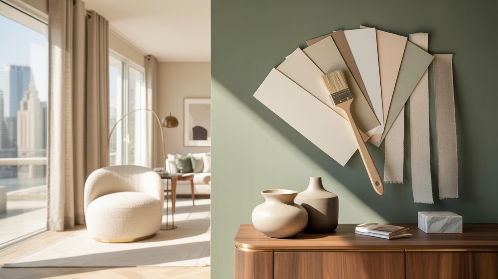
Unlock the Secrets to Choosing the Ideal Paint Colors for Your Space
Choosing the right paint tones can transform any space, creating an atmosphere that reflects personal style while enhancing the structural beauty of a home. Across the South Shore, from the historic seaside cottages of Scituate and Cohasset to the modern estates in Hingham and Norwell, selecting the perfect palette is both an exciting creative journey and a strategic design challenge. Understanding the nuances of color selection is essential for achieving a cohesive look, whether you are aiming for a serene coastal retreat or a vibrant, modern gathering space.
- Psychology Matters: Use cool tones for relaxation and warm tones for high-energy social areas.
- Light dictates Depth: Natural light in coastal Massachusetts can shift paint colors dramatically throughout the day.
- Test Before Investing: Always observe physical samples against existing flooring and furniture.
- Undertones are Vital: Identifying hidden "hidden" colors (like pink in a beige or green in a gray) prevents design clashes.
Understanding Color Psychology
Color psychology plays a crucial role in how a room feels and functions. Different hues evoke specific emotions and can influence the behavior of those in the space. For instance, blues and greens are often associated with calmness and rejuvenation, making them ideal choices for bedrooms in Duxbury or spa-like bathrooms in Hanover.
In contrast, warm colors such as terracotta, soft reds, and oranges can energize a space. These "active" colors are highly suitable for social hubs like kitchens and dining rooms. By understanding these psychological triggers, you can select colors that align perfectly with the intended purpose of every room in your home.
The Impact of Natural Light in South Shore Homes
Natural light significantly impacts how paint colors appear on your walls. A shade that looks like a perfect neutral in a showroom might lean too yellow or blue under the specific lighting conditions of your home. Eastern Massachusetts light changes seasonally, which must be factored into your decision.
- Bright, Sun-Drenched Rooms: Spaces with abundant natural light can handle darker, more saturated colors without feeling oppressive.
- Low-Light Areas: North-facing rooms or smaller spaces in towns like Weymouth or Quincy may benefit from lighter shades with high Light Reflectance Values (LRV) to create a sense of openness.
Observing how light shifts from the cold morning glow to the warm "golden hour" ensures your color maintains its appeal 24 hours a day.
Harmonizing with Existing Elements
When selecting paint tones, it is important to consider fixed elements: flooring, cabinetry, stonework, and large furniture pieces. The goal is to create a cohesive visual flow. If your home features the warm oak floors common in Braintree or Plymouth, colors with warm undertones will feel most harmonious. If your décor leans toward cool metallics and marble, cooler paint tones typically provide a more sophisticated match.
The Importance of Testing Paint Samples
Before committing to a full renovation, testing samples is a non-negotiable step. Professionals recommend painting large swatches on multiple walls rather than relying on small chips. This "real-world" testing allows you to avoid costly mistakes and see how the pigment reacts to your specific architecture. Observe these samples over 48 hours to see how they look during cloudy New England days versus bright, sunny afternoons.
Using Color to Define Architectural Spaces
In the open-plan layouts prevalent in Marshfield and newer Hingham developments, color serves as a functional tool to define zones without physical barriers. Using varied shades or intentional accent walls can delineate a dining area from a home office or living lounge. This strategy adds visual texture while maintaining a seamless transition between rooms.
Balancing Bold and Neutral Tones
Success lies in the balance. While bold colors add drama and personality, neutrals provide the necessary visual "breathing room." A popular South Shore design strategy involves keeping primary walls in a timeless neutral while using bold navy, forest green, or charcoal for kitchen islands, built-in shelving, or powder rooms.
Decoding Paint Undertones
Undertones are the subtle, secondary colors that emerge once a paint is applied to a large surface. Two "whites" can look identical on a swatch, but one may have a yellow (warm) undertone while the other has a blue (cool) undertone. Understanding these nuances is vital for preventing your gray walls from looking purple or your beige from looking peach. Comparing samples side-by-side against a piece of pure white paper can help reveal these hidden hues.
Seeking Professional Design Advice
If the array of thousands of swatches feels overwhelming, a professional color consultant or interior designer can provide clarity. These experts understand how different brands, finishes (matte vs. eggshell), and pigments interact with Massachusetts’ unique regional light. Working with a professional ensures a polished, high-end result that maximizes your home’s value and aesthetic appeal.
Transform Your Space with the Right Colors
Choosing the perfect paint tones can truly transform your living space, making it more inviting and reflective of your lifestyle. Whether you are prepping a home for sale or settling into a long-term residence, the right palette is the foundation of good design. If you are ready to perfect your space, reach out to Juli Ford for expert advice and personalized assistance in bringing your vision to life.
Frequently Asked Questions
What is the best way to choose a paint color for a dark room?
For rooms with limited natural light, choose colors with a high Light Reflectance Value (LRV) and avoid colors with heavy gray or brown undertones, which can make a space feel "muddy." Lighter neutrals or soft pastels help bounce what little light is available around the room to create a brighter atmosphere.
How do I know if a paint color is warm or cool?
The easiest way to identify a color's temperature is to compare it to a primary "true" version of that color. Warm colors have hints of red, orange, or yellow, while cool colors have undertones of blue, green, or purple; looking at the bottom of a paint manufacturer's color strip often reveals the most saturated version of the hue, making the undertone more apparent.
Should all the rooms in my house be the same color?
While you don't need to use the exact same color in every room, maintain a "whole-house palette" to ensure flow. Using different strengths of the same hue (tonal variation) or keeping a consistent trim color throughout the home creates a professional, unified look even if individual rooms have different personalities.
What paint finish is best for high-traffic areas?
For areas like hallways, kitchens, and mudrooms, an eggshell or satin finish is ideal because it offers a slight sheen that is easy to wipe down and resist stains. Save matte or flat finishes for ceilings or low-traffic formal rooms where you want to hide surface imperfections.
Explore more tips & guides
Explore Resources & Guides: Planning a day out with three generations in tow? That's my specialty. Grab the free Multi-Generational Living Guide for support navigating life together, at every stage. Plus more guides, checklists, and tools for your next move. juliford.com/multi-gen.
Workshops & Events: Join live workshops and events on real estate, multi-generational living, and agent growth. juliford.com/events.
Book a Strategy Session: Let's map out a plan that fits your family and your timeline. juliford.com/consulting.

About the Author
Juli FordFounder of Home After 50 · CSA · Licensed Real Estate Broker
Juli Ford is the founder of Home After 50, a nationally recognized multigenerational living expert, real estate broker, and Certified Senior Advisor® helping women and families reimagine home and life in the next chapter, together.
As featured in The New York Times, Newsweek, Business Insider and Fox & Friends.
Read More Blogs
Related Articles

Home After 50 | Multi-Gen Living
5 Money Talks Every Multigenerational Home Should Have Before the Holidays (Ranked Easiest to Hardest)

Home After 50 | Multi-Gen Living
Will Your Home Equity Pay For In-Home Care? What a New Study Found

Multigenerational Homes